Wednesday, 30 January 2013

Magazine Cover Test 1


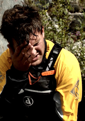
Out of the pictures I posted about this image stood out as the most potent portrait due to it's emotion, relatability and obvious mise-en-scene to the common kayaker and mountaineer, making it ideal for the magazine cover.

With slight adjustments of exposure curves and the addition of artificial noise grain, the image looks gritty and powerful.

Here I am cropping the image to A4 (210x297) printing size to suit that of modern magazines.

Applying the rule of thirds I have created two images here using the centre of Mike's head as the 1/3rd line cut off.

Both of these images capture his expression well and are quite powerful. Relating to my 'lines and structure' post in August, the left image attracts you to his eyes at first, then his arm and hand on his face is noticed. The direction of his hand points into the exposed background which seems natural. The right image however 'cuts' this imaginary line off as the image is cropped. It makes the image appear somewhat awkward and out of balance. Whilst this effect can be useful, it seems almost too evident here.

As far as the magazine title is concerned, as there is no vertical space above Mike's head available. For this reason I had to experiment with other crops.


 After some experimenting I decided to go with the diagonal-thirds crop. Whilst at first it may appear Mike's head is in the middle, it is actually slightly to the left. This subtle movement is sufficient to allow imaginary and concrete lines such as his line of sight (looking down and right) and his arm/hand (pointing up and right) to point towards the majority of the frame. This prevents the awkward feeling we experienced in the previous, right picture.

The diagonal thirds here involve the elbow on the left with a strip of background around it to help it stand out, his face (and his hand) and an entirely exposed background in the final third. With more open space now the title should be exposed enough to be recognisable. Although many modern magazines rely on the authority/power and popularity of their names to be recognised whilst their titles hide behind the subject.


Here is the cover before text has been put on. A nicely fitting, under-exposed area at the bottom of the frame will be used for text, as well as the side columns and the main title.


Poster Final

Here is my updated poster with conventional 'golden' production team credits for easy recognition and release date added.


Poster Logos


Here I have added Facebook and Twitter inserts to encourage my modern audience to continue consuming my media after watching the film or to subscribe to social media posts where I can release teasing media pre-film release to help build anticipation as a form of advertising.

As in my trailer I have advertised Danny Boyle promoting my film - this will attract audiences who are fans of Boyle as he directs films within this genre and is regarded as very talented.

Finally my AF Productions logo is placed in the far corner for production team recognition.


Poster Font/Colours


After trying a few fonts out I decided to go with a font you have seen in some of my previous posts. It suits this poster well as it adds a dynamic and powerful touch to the image.

I have been inspired by modern film posters and created a black-gradient at the bottom as space for advertising logos and cast.

 Green is a great colour for the poster with connotations of freshness, nature and originality. It serves well in this picture but is slightly too joyful and happy in conjunction with the picture.


 Black is the opposite - it contrasts perfectly with the clouds and stands out like a sore thumb. This is great as it is noticeable but it connotes darkness, grunginess and evil. As my target audience is fellow mountaineers I am looking for colours that suit the concept of nature slightly better.


 Blue suits nature well as it is the colour of water and the sky. It connotes tranquillity and flow. However it blends in with the sky slightly too much and doesn't resemble the natural environment or the sense of adventure quite as much as green.


This teal colour is between blue and green. Unfortunately it seems to remind me of someone when they feel sick - this colour is not pleasant to say the least.


This darker green connotes nature, originality and adventure. It's the correct shade to show it is green whilst being dark enough not to connote joy and happiness. It has some power behind it and implies some sense of seriousness too. This does perfectly.


Monday, 28 January 2013

Film Poster Crops


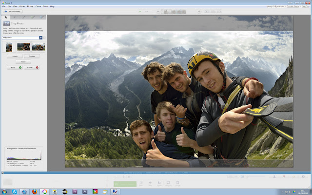
After choosing the most suitable photographs/screen grabs in a previous post and testing mixes of different images using fading layers and overlaps, I decided to use a single image as it is clear and more powerful than several images. A bold photograph that captures character emotion and the essence of the film was needed leaving me with this (below) as the best choice.

I am currently planning to use the concept of displaying text in a bar at the bottom like other posters of this genre do, leaving the title and the image boldly exposed.

Here I am using a 16:9 crop to match that of my film. This size was chosen as it is 1080p which suits the resolution of modern monitors and HDTVs.


Here I am using a 5x8 crop which leaves slightly more space for titles and text. Subtle crop techniques include cropping half-way on a knuckle rather than trimming a knuckle off as that makes the character appear deformed and a pre-crop was done to pull the characters slightly to one side rather than exactly in the middle.
 
Posted by Picasa

Friday, 18 January 2013

Questionnaire

I will soon be presenting my film trailer for feedback in front of roughly thirty people. Here is the questionnaire I have made for quick, concise feedback:


Aim For Eddie Trailer – Jamie Prout


Please circle your answers


Was it clear this preview was a trailer?


YES    /    SLIGHTLY    /    NO


Did my trailer conform to the action-adventure genre?


YES    /    SLIGHTLY    /    NO


Did the music suit the trailer?


YES    /    SLIGHTLY    /    NO


Did the increase in tension and tempo engage you?


YES    /    SLIGHTLY    /    NO


Now you have seen the trailer, would you look forward to seeing the feature-length film of it?


YES    /    SLIGHTLY    /    NO


Do you have any recommendations on how to improve the trailer?


Thanks for your time J

Thursday, 10 January 2013

Magazine Cover Analysis

Empire Magazine Django Unchained Cover

Magazines:
1) Sight & Sound
2) Empire
Films on Front Cover:
1) Sightseers
2) Django Unchained
Genre of Magazines:
1) Film magazine
2) Film magazine
Target Demographic/VALs (Values Aspirations Lifestyle)
1) Niche, academic demographic intended
2) Mainstream target audience
Magazine Name Suitability to Target Audience:
1) Connotations of technological environment, appeals to indie film makers, relates to how film was made
2) Suits mainstream demographic, connotations of power, leadership and a large group. Can make audience feel as if they are part of the 'empire'
Typology
1) Smooth, rounded, shadowed text helps the title contrast and stand out from the background
2) Harsh, sharp-edged, bold text gives us a feeling of power and authority
Captions/Text
1) More text present than on Empire, implies magazine is less entertaining-orientated & more information-orientated. Refers to several names, symmetrical structure
2) Dynamic structure (eg Italics used and film title rotated), showcasing films, use of powerful adjectives, entertainment-based. Subject on top of text "EMPIRE", helps emphasise subject but also gives the title power - audience already knows it says "EMPIRE" despite not being able to see the whole word, give the title power and authoritiy
Colours
1) Slight contrast, nothing very bold compared to background
2) Harsh, powerful, contrasting and eye-catching colours. Enticing, suits target demographic
Subjects
1) Mix of foreground & background elements, subtle pragmatics
2) Obvious subjects, almost no background features at all, clear and concise for target audience
Featured Articles
1) Successful but not majorly popular film producer articles on front cover - target audience of indie film makers and producers aspire to be these people
2) Cllear, concise and simply phrases used "Review of 2012: Iron Man 3, Star Wars VII" etc, minimum words to maintain audience engagement and tease them into reading more. Features articles on famous films
Cover Lines
1) No obvious cover lines present but features being advertised present, e.g. successful producer articles & "The London Film Festival Special Edition"
2) No overt cover lines present but other features such as "Oscars Special!" and "PLUS! Review of...." are used to entice the target audience and tease them into reading the magazine

Wednesday, 9 January 2013

Magazine Cover & Poster Planning

I have 'shortlisted' a bunch of photographs and video screen-grabs to use for the cover and poster.
This group of photographs were chosen and briefly edited as they contain content that is intriguing but not overly revealing; acting like a tease much like the trailer. I have aimed to select photographs/screen grabs that engage emotion and help people relate to the images either through construction/composition, colours or a display of relationships between the subjects.


Somewhat weak centre piece. Not particularly thought provoking or engaging

Shows classic mountaineer life; relatable. Mediocre backdrop, some characters present

 Decent backdrop, some characters present, road-trip style emphasised, saturated colours

Excellent background, mild saturation gives impression mountain is daunting and overwhelmingly powerful. Master-shot style

Good backdrop, emotional scene, relatable. Calm among the chaos - likely to use this shot

Action shot, heel-hook. No incredible task, single character present

The whole team, very useful for relating to characters and engaging audience. Backdrop could be cropped further

 Several characters present but not all. Purple tinge, connotations of mystery. Cars and kayaks visible, camping style obvious

Excellent centre piece. Powerful, features all characters, lively. Great backdrop

Good facial expressions but under-exposed faces. Engaging and relatable in regard to road-trip aspect

'Failure' implication, powerful scene, could be used anywhere on poster

 'Pain' implication, ""

Could be used at side, relates to road-trip aspect, well composed action shot. 'Living on the edge'


Friday, 4 January 2013

Final Film Edit

Final Piece

Here's my full edit with minor adjustments due to audience feedback and the addition of titles

This video is unlisted and requires this link to access: Click here