
Sunday, 3 February 2013

Magazine Production Continued
With many tweaks and much re-positioning of items I finally constructed a layout that flowed with the background. With all real information (excluding the interview) and original imagery (both photographs taken by myself), the magazine is legally legitimate.
Colours were selected carefully: black and white to contrast from background, reds to show exclusive information and blue to match that of the sky, water etc. to further appeal to my target audience.
With no 'cheesey' sticker-like pugs and only one tagline, the magazine is entertaining yet serious enough to appeal to my target audience.
I have two pieces to decide between; the only difference being the image in the bottom-right corner. The first cover shows a candid shot of my subject with a slackline. The slackline and the person themselves appeal to my target audience. The second cover shows Matt kite-boarding with a snowy mountainous backdrop. This scene appeals slightly more to my target audience, however the personal feeling of relatability is greater when making eye contact with the subject looking at you in the first cover image. As well as this the colours (lower-key and brown) suit the magazine cover and are less distraction. For these reasons the first cover will be the base of my final piece.
After some feedback and matching with the specification it became evident the poster is not enough like other film magazine posters I have analysed in previous posts. Although the conventions match the text content does not. I will revise my poster and create one which better resembles a film-specific magazine.


Magazine Cover Development
The magazine cover is coming on nicely. Typical cover construction techniques are required such as layering, use of symmetry/construction asymmetrically, re-formatting text and creating bar codes.
Just to give a quick demonstration, you can see I have selected the area around the logo that consists of white space and have removed it from the layer so only the logo itself, and not the white background, is displayed above the background layer.
Just to give a quick demonstration, you can see I have selected the area around the logo that consists of white space and have removed it from the layer so only the logo itself, and not the white background, is displayed above the background layer.


Magazine Title
I decided to subvert the typical convention of magazines where part of the title would appear 'behind' a subject as in the case of this photograph I am using, Jack is in a good position to look as if he is linked to the title. There is also plenty of low-detail space in the sky for the title to be clearly displayed.
Whilst experimenting with various fonts I came across dafont.com; an open-source font website that allows you to install font packages to your computer.
The particular style of font I went for in the end, as shown below, has slightly un-even and irregularly shaped characters which presents the magazine as a slightly edgy and unique read. The block-serifs are simple and give the title a bold effect.
I experimented with different colours too but black was the most suitable as it contrasted with the background nicely, was simple, bold and easy to read.

Magazine Cover Test 2
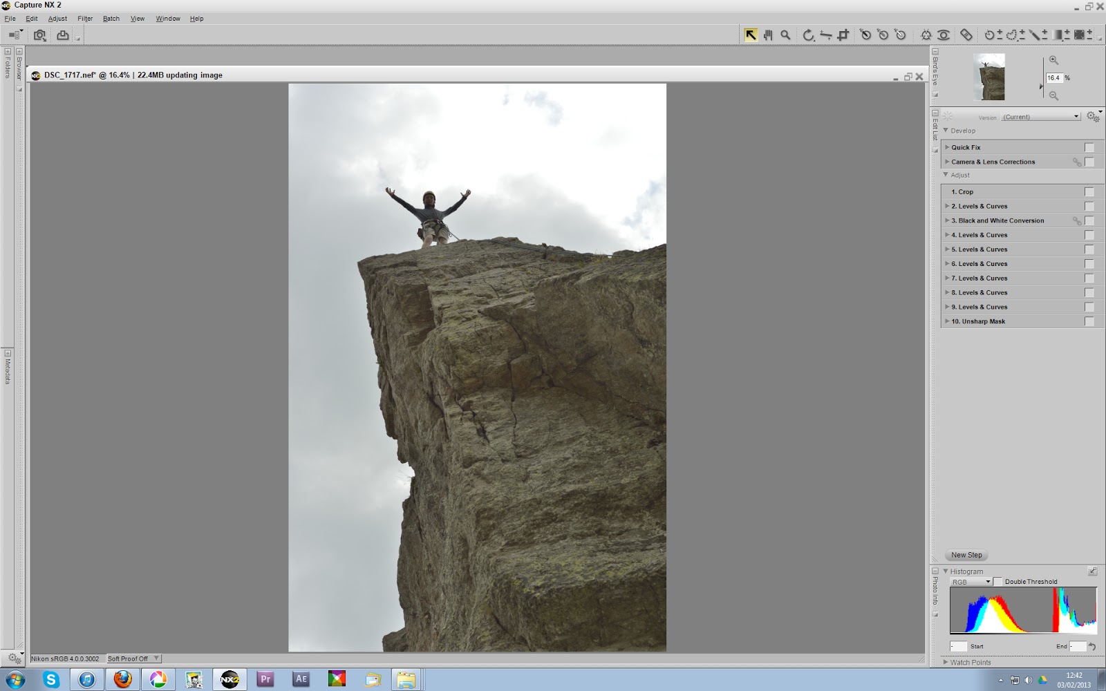
Again I have cropped the image to A4 (210x297) printing size to suit that of modern magazines.
Adjustments to cloud textures have been added in post-processing, as well as colour variations, artificial light sources, exposure curve tweaks, colour-value filters and an unsharp mask.
The two main tools I used to select what areas of the image will be effected by these adjustments were a brush-selection tool with feathering and an area-selection control point that compares a pixel's colour values to the adjacent pixel values and applies a greater effect-opacity to the pixels with similar values.


Here is the image post-processing.

Presented below are the two final images for the magazine.
Although the first (left) image is more powerful and relatable as the specialist mountain gear is more obvious as are the facial expressions, the right image is showing the feeling every mountaineer loves when completing a task. The right image also leaves more suitable space at the top for the magazine titles as, despite the left image being cropped as large as possible, the left image's title space is mostly occupied by Mike's head, rendering any title that would go behind his head almost unreadable. For this reason I will use the right image for the magazine cover.


Wednesday, 30 January 2013
Magazine Cover Test 1
Out of the pictures I posted about this image stood out as the most potent portrait due to it's emotion, relatability and obvious mise-en-scene to the common kayaker and mountaineer, making it ideal for the magazine cover.
With slight adjustments of exposure curves and the addition of artificial noise grain, the image looks gritty and powerful.
Here I am cropping the image to A4 (210x297) printing size to suit that of modern magazines.
 Applying the rule of thirds I have created two images here using the centre of Mike's head as the 1/3rd line cut off.
Both of these images capture his expression well and are quite powerful. Relating to my 'lines and structure' post in August, the left image attracts you to his eyes at first, then his arm and hand on his face is noticed. The direction of his hand points into the exposed background which seems natural. The right image however 'cuts' this imaginary line off as the image is cropped. It makes the image appear somewhat awkward and out of balance. Whilst this effect can be useful, it seems almost too evident here.
As far as the magazine title is concerned, as there is no vertical space above Mike's head available. For this reason I had to experiment with other crops.


After some experimenting I decided to go with the diagonal-thirds crop. Whilst at first it may appear Mike's head is in the middle, it is actually slightly to the left. This subtle movement is sufficient to allow imaginary and concrete lines such as his line of sight (looking down and right) and his arm/hand (pointing up and right) to point towards the majority of the frame. This prevents the awkward feeling we experienced in the previous, right picture.
The diagonal thirds here involve the elbow on the left with a strip of background around it to help it stand out, his face (and his hand) and an entirely exposed background in the final third. With more open space now the title should be exposed enough to be recognisable. Although many modern magazines rely on the authority/power and popularity of their names to be recognised whilst their titles hide behind the subject.

Here is the cover before text has been put on. A nicely fitting, under-exposed area at the bottom of the frame will be used for text, as well as the side columns and the main title.

Poster Final
Here is my updated poster with conventional 'golden' production team credits for easy recognition and release date added.


Subscribe to:
Posts (Atom)