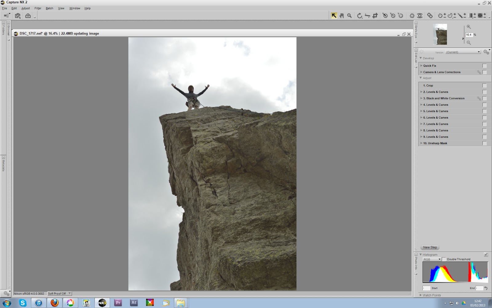
Again I have cropped the image to A4 (210x297) printing size to suit that of modern magazines.
Adjustments to cloud textures have been added in post-processing, as well as colour variations, artificial light sources, exposure curve tweaks, colour-value filters and an unsharp mask.
The two main tools I used to select what areas of the image will be effected by these adjustments were a brush-selection tool with feathering and an area-selection control point that compares a pixel's colour values to the adjacent pixel values and applies a greater effect-opacity to the pixels with similar values.


Here is the image post-processing.

Presented below are the two final images for the magazine.
Although the first (left) image is more powerful and relatable as the specialist mountain gear is more obvious as are the facial expressions, the right image is showing the feeling every mountaineer loves when completing a task. The right image also leaves more suitable space at the top for the magazine titles as, despite the left image being cropped as large as possible, the left image's title space is mostly occupied by Mike's head, rendering any title that would go behind his head almost unreadable. For this reason I will use the right image for the magazine cover.


No comments:
Post a Comment