Sunday, 17 February 2013

Evaluation 3

3.'What have you learned from your audience feedback?'

Below is a short clip of an audience watching my trailer and filling out a questionnaire which can be seen below the video.


Monday 21/01/2013, thirty people age range 17-19, 15 males 15 female watched my film trailer and supplied feedback. Whilst they are not my ideal audience (as they are not all into adventure-sports) they are within the correct age bracket and can help produce fairly accurate feedback.
Here is the computer-template of the questionnaire with answers represented in numbers. My comments on the results can be seen in red text.

Results:

Aim For Eddie Trailer – Jamie Prout


Please circle your answers


Was it clear this preview was a trailer?


YES (14)   /    SLIGHTLY  (13)   /    NO (3)
 
Despite following many conventions of trailers it seems as if some people were left uncertain that it was a trailer. This may have been due to the slightly niche genre of the film and the fairly short titles at the end that presented release dates etc.

Did my trailer conform to the action-adventure genre?


YES (24)    /    SLIGHTLY  (4)   /    NO (1)

 It appears I managed to follow conventions of my genre fairly well, leaving almost no confusion over what elements were involved in the trailer.

Did the music suit the trailer?


YES  (28)   /    SLIGHTLY (2)   /    NO (0)

 As expected the music helped build tension as well as being perceived as 'cool' or recognisable by the audience.

Did the increase in tension and tempo engage you?


YES (16)   /    SLIGHTLY (10)    /    NO (4)

 I am slightly surprised by this. Elapsed time of shots decreased towards the climax, the music crescendo added to the build up and the content of the trailer became increasingly intense. Despite this, a fair amount of people were not fully engaged. The environment the audience were in was very informal and sociable - it is likely this environment had an effect on their viewing as their reactions will not just be towards the trailer, but also towards their friends present. This, as well as how the audience were not all adventure-sportsmen, help explain how they were not as engaged as I had hoped.

Now you have seen the trailer, would you look forward to seeing the feature-length film of it?


YES (17)    /    SLIGHTLY  (10)   /    NO (3)

 I am fairly pleased at this result as these people are not my ideal target demographic. This result however helped me realise that future films will be more successful if they could reach out to a larger audience.

Do you have any recommendations on how to improve the trailer?

Most common points:

(17) Storyline was not particularly deep or detailed: A group of athletes performing sports on a road trip and someone almost dies.

About half of the audience were not fully satisfied with the narrative presented. This is likely due to how the audience here are not my ideal target demographic and how in the questionnaire I wrote "Did my trailer conform to the action-adventure genre?" in order to keep the questionnaire short, but in reality I have been working for a trailer in the 'action-adventure docu-drama' genre. If the audience had known the trailer was more docu-drama based they may have enjoyed the small details and somewhat basic general storyline more.

(5) Almost no dialogue in trailer, would relate to characters more if I heard them talk.

My inconsistency in trailer dialogue seems to have let me down for five people in audience. Some form of narration or dialogue may have helped my trailer sell the characters and become more relatable. It is also worth noting that my ideal target audience were not available so non-a mountaineering audience of a suitable age participated in my questionnaire instead as I had access to them and they are fairly similar to my ideal audience.


This graph shows the individual values for each question (an "Agree" answer is always the positive response):


This graph shows the total attitude towards the trailer based on the questionnaire results:


In conclusion, my audience feedback has been key in helping me realise how to effectively plan and produce future projects. The feedback has been particularly helpful for realising that increasing audience numbers is crucial and can be achieved by widening the target audience when planning. It has taught me that niche film genres, like this project's film, have smaller audiences, appeal to a smaller audience and have smaller resources for production as a result.

Sunday, 10 February 2013

Evaluation 2

2.'How effective is the combination of your main product and ancillary texts?


Here are copies of my final media pieces for reference:


My main product, the film trailer, and my two ancillary tasks, the magazine cover and poster, work in conjunction with each other to entice audiences to watch the film. It is crucial that all texts have similarities in order to allow the audience to recognise the film when seeing different texts.

Characters are recognisable across all mediums of advertising. This may sound obvious, but it is very effective to have the same character/characters featured across all the texts. The main character, Jack, can be seen at the front of the poster and as the sole character in the magazine cover. It is important for the characters to be recognisable as the characters may be followed by fans from other media such as other films, Twitter, etc. All character names are displayed of the poster and trailer.
Another effective but common practice is to display the title on all mediums of advertising - this way the entire event/film will be memorised by simply recalling a few words: "Aim For Eddie".

As a result of me using the same fonts and colour schemes throughout my project, all advertising media I produced can be easily associated and the film itself more easily recognised. The fonts and colour scheme were chosen as they suit the genre (discussed in previous posts) so by not deviating from this style I have ensured my media texts are as effective as possible. For extra recognition the logo is displayed on both the poster and film trailer.

All my work captures the sense of achievement mountaineers get when being successful in their activity. The magazine cover shows Jack celebrating at the top of a climb, the poster has our whole group at the top of a pinnacle and the trailer is full of clips showing us reaching destinations and achieving goals. This feeling of achievement is very relatable and is an integral hook for the audience. This feeling is mostly shown through the clear facial and body language seen in all three media texts.

My ancillary tasks combined help advertise the trailer as well as the film itself - fortunately this increases the likelehood of the trailer, my most powerful form of advertising, being watched.
All of my texts are subtle in narrative and do not reveal too much about the story - this ensures the audiences are left wanting more and almost feel obliged to watch the feature length film.

 The sense of achievement is a concept that acts as a hook in my trailer, as well as in my other products, to engage my target audience with the powerful feeling of accomplishment. Here is a screen-grab from my trailer showing Mike using a celebratory gesture with his hand and face. In my poster and the magazine cover gestures are also used to show this.
 The sense of achievement can also be felt in this screen grab where our entire group has finished climbing the pinnacle on the right and we can be seen cheering. This extreme long-shot also exposes the vulnerability of man in nature, further emphasising the achievement.
 Engulfed in this hostile high-grade river, Mike is surrounded by an aggressive environment which he must control. The outcrop of overhanging rock in the magazine cover is exhilarating for any keen climber and the poster links to this concept due to its enormous backdrop that surrounds the subject.
 Stunning environments where the subject (ie the character) appears diminutive are seen in all three products.


Thursday, 7 February 2013

Evaluation 1


1. In what ways does your media product use, develop or challenge forms and conventions of media products?


Many of my techniques for acquiring the footage I needed for my film involved using or being inspired by current ideas. After seeing the stability and accessibility benefits of using small, high-resolution cameras such as DSLRs I decided to use a few for my film. The sensors in DSLRs are more sensitive and generally better quality than other hand-held cameras, without spending thousands of pounds. I also built my own camera rig which proved extremely useful for moving shots or to steady the camera when in a location that did not permit carrying tripods.


Here is Adam Colton, an extreme sports film-maker using a DSLR with a camera rig (left) and myself (right).


The music in my trailer is of a similar genre to other adventure-sport films. This genre of music appeals to the new generation of perceived 'gung-ho' youth. Here is an example of similar music used by Red Bull.


Powerful diegetic sound effects that were not recorded on scene such as the heart beat-like sound and the tinnitus after an accident appear in both this trailer (left) and my trailer. These sounds help enhance the atmosphere whilst showing the break of equilibrium through the character's eyes.


The mise-en-scene is similar in other adventure-sport films (Black Diamond films, left) mainly due to the equipment and surroundings. In both the BD example and the screen-shot from my trailer you can see specialist equipment being used such as prussik, ropes, belay devices, etc. By filming this equipment in use the viewer is somewhat flattered as they know and understand what this equipment is for.


The stunning, mountainous backdrops add to the immersive diegesis when constructed and positioned effectively in the camera frame. As shown in the BD screen-shot and in mine (right), the frame has been delicately composed to effectively fit all of the subjects in.


The Collective Film's short-film, "Seasons" features seven riders as the main characters. "Strength In Numbers" by Ant Hill Films is another example of a small group being used as the main characters. According to many famous psychology memory models, approximately six 'chunks' of imformation is the most ideal amount to store in short term and long term memory.

This means that by featuring roughly six (or less) characters in your film, all of them should be easily memorable after watching the trailer or film. My trailer conforms to this idea of using a small group - big enough to show individual differences in characters but small enough to recall each member - as my group size is five.

The narrative of my trailer is also very conventional to the genre: a group of characters go on adventure, equilibrium is broken when a character is in danger of death, the person is saved/recovers and finally joins the group and restores the balance. This plot is identical to Touching The Void for example. It is very simplistic but allows room for very individual experiences to be portrayed during the film. The final stage, the restoration of equilibrium, is not shown in trailers of this genre. Much like my trailer, in 127 hours the main character has his life threatened and we do not see much more - this leaves the audience wanting to complete their experience of the film by watching the feature-length version.


I found myself presenting titles and credits as selling points or as key information throughout my trailer as other trailers do too.


My trailer also subverted some concepts that are common or conventional of the genre.
For example, the only dialogue in the trailer was the swearing in the beginning scene - this helps exaggerate the sweating and make it stand out as more potent and meaningful than it would have been if there were lots of dialogue. Most trailers are more consistent though and either have no dialogue or a commentary throughout. Whilst my trailer seems less professional by having this snippet of dialogue, it has a potent affect on the audience.

Aim for Eddie Trailer


The first third of my trailer used diegetic sounds only, as the last two thirds used music to build atmosphere and tension. Again, most trailers tend to be more consistent with their approach.


I have pushed the boundaries of conventionalism when it comes to relatability: whilst frequent facial expressions is nothing out of the ordinary, the inclusion of overt POV shots (left) where the perspective is clear or even part of the filmer is visible is a gamble of mine, sacrificing professionalism for a more powerful feeling of impressiveness. The audience are not just watching us perform sports, they are doing them and filming them with us.


Here the shadow of my arm and camera is one of the main subjects and stands out thanks to the contrast in light. It makes the scene relatable and helps the audience feel as if they are in the world we have created.

Here is a car mirror shot. This is the kind of view a person would get if they looked out of the car window - again, helping the scene become relatable.


Here is a shot of Mike holding my rig whilst I am filming with a set up tripod. We can make the audience feel like they are involved by showing the filmer in the shot - this technique is also useful as it almost creates a shot reverse-shot effect where we can use visual subjects to create a clean transition between shots.This challenges the conventions of the genre at present but I would not be surprised to see it becoming more common in the future, especially as many sports videos are of athletes with skill levels so far beyond the common person that the films are no longer very relatable.


Sunday, 3 February 2013

Magazine Cover Final


Magazine Production Continued


With many tweaks and much re-positioning of items I finally constructed a layout that flowed with the background. With all real information (excluding the interview) and original imagery (both photographs taken by myself), the magazine is legally legitimate.

Colours were selected carefully: black and white to contrast from background, reds to show exclusive information and blue to match that of the sky, water etc. to further appeal to my target audience.

With no 'cheesey' sticker-like pugs and only one tagline, the magazine is entertaining yet serious enough to appeal to my target audience.

I have two pieces to decide between; the only difference being the image in the bottom-right corner. The first cover shows a candid shot of my subject with a slackline. The slackline and the person themselves appeal to my target audience. The second cover shows Matt kite-boarding with a snowy mountainous backdrop. This scene appeals slightly more to my target audience, however the personal feeling of relatability is greater when making eye contact with the subject looking at you in the first cover image. As well as this the colours (lower-key and brown) suit the magazine cover and are less distraction. For these reasons the first cover will be the base of my final piece. 

After some feedback and matching with the specification it became evident the poster is not enough like other film magazine posters I have analysed in previous posts. Although the conventions match the text content does not. I will revise my poster and create one which better resembles a film-specific magazine.


Magazine Cover Development

The magazine cover is coming on nicely. Typical cover construction techniques are required such as layering, use of symmetry/construction asymmetrically, re-formatting text and creating bar codes.

Just to give a quick demonstration, you can see I have selected the area around the logo that consists of white space and have removed it from the layer so only the logo itself, and not the white background, is displayed above the background layer.


Magazine Title


I decided to subvert the typical convention of magazines where part of the title would appear 'behind' a subject as in the case of this photograph I am using, Jack is in a good position to look as if he is linked to the title. There is also plenty of low-detail space in the sky for the title to be clearly displayed.

Whilst experimenting with various fonts I came across dafont.com; an open-source font website that allows you to install font packages to your computer.
The particular style of font I went for in the end, as shown below, has slightly un-even and irregularly shaped characters which presents the magazine as a slightly edgy and unique read. The block-serifs are simple and give the title a bold effect.
I experimented with different colours too but black was the most suitable as it contrasted with the background nicely, was simple, bold and easy to read.


Magazine Cover Test 2


Again I have cropped the image to A4 (210x297) printing size to suit that of modern magazines.
Adjustments to cloud textures have been added in post-processing, as well as  colour variations, artificial light sources, exposure curve tweaks, colour-value filters and an unsharp mask. 

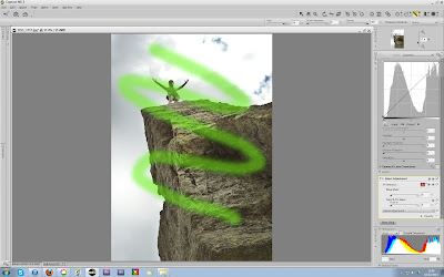
The two main tools I used to select what areas of the image will be effected by these adjustments were a brush-selection tool with feathering and an area-selection control point that compares a pixel's colour values to the adjacent pixel values and applies a greater effect-opacity to the pixels with similar values.


Here is the image post-processing.


Presented below are the two final images for the magazine.
Although the first (left) image is more powerful and relatable as the specialist mountain gear is more obvious as are the facial expressions, the right image is showing the feeling every mountaineer loves when completing a task. The right image also leaves more suitable space at the top for the magazine titles as, despite the left image being cropped as large as possible, the left image's title space is mostly occupied by Mike's head, rendering any title that would go behind his head almost unreadable. For this reason I will use the right image for the magazine cover.